Chase Mobile App
Adding Financial Fitness to the Chase mobile app
Whether you’re supporting a family, retired or planning for the future, figuring out finances is at least some part of your life. Getting a little help and advice can go a long way to realizing your spending habits and how a small adjustment can make for better financial fitness.
The Project
The Chase Financial Fitness feature is an additional feature for the existing Chase mobile app. The idea is to utilize a person’s existing information and help them find a better way to save, whether it’s for now or the future. In addition, utilizing existing Chase features and products will solidify the brand loyalty and keep customers coming back to the Chase ecosystem.
Project Goals
To design a social media app focused on augmented reality that is more than a gimmick and brings friends together even when they’re far apart. To build a safe and fun app to share or create experiences among users.
Role
user research, UX designer, UI designer
Sktch
Ai
FrmrX
Timeline
2 weeks
Ramp up
Let’s Get Started
I was very familiar with the Chase app going in to this project since 1) I use it on a regular basis and 2) I actually worked on the app and desktop site within a team at Chase. The app covers a lot of needs for users, but it’s also lacking a way for users to track their finances in a helpful way. It made for an easy decision knowing the app was lacking this feature and competitors were implementing and pushing their version through marketing… but how could I address users needs and pain points in a way that no other app was doing? Were there gaps? Only one way to find out…
Competitor Analysis

Research
Research Methodologies
Questionnaire – I created a series of questions based around spending habits and what respondents were currently saving for or were interested in when it came to saving. I touched on the number of times respondents made certain types of purchases and how comfortable they were with them. Lastly, I asked about how they currently managed their finances and purchases.
Competitor Analysis – I conducted extensive research of financial apps, whether they were from large institutions like Chase, Bank of America, etc., or independent companies like Mint or YNAB. I also read articles about choosing financial apps to see what users were looking for and what was being done already.
Secondary Research – I conducted research about different generations, their finances and what their goals currently are. I made sure I looked at several aspects, whether it was savings, investments or current financial well-being for each generation.
Needs
%
Wanted to save and/or invest money
%
Feel the impact of their non-essential purchases on their ability to save
Pain Points
%
Buy meals out at least 1-2 times per week
Wants
%
Used a computer or mobile app to keep their cash flow in order
%
Can manage their finances but still seeking support or options to save/invest
Define
Research Synthesis
Based on the questionnaire and research I performed, a majority of users from every generations are moving to app-based banking as well as budgeting and saving. They were very interested in both saving now and for the future, but most felt they had their non-essential spending under control. I wondered if they needed to see what they could have invested or saved for the future and how a few Starbucks could turn into something more with some investment help.
Personas
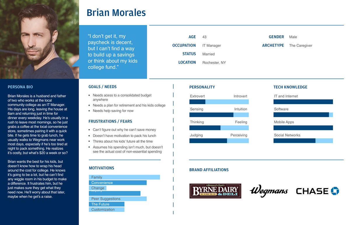
Persona 01

Persona 02
Empathy Maps
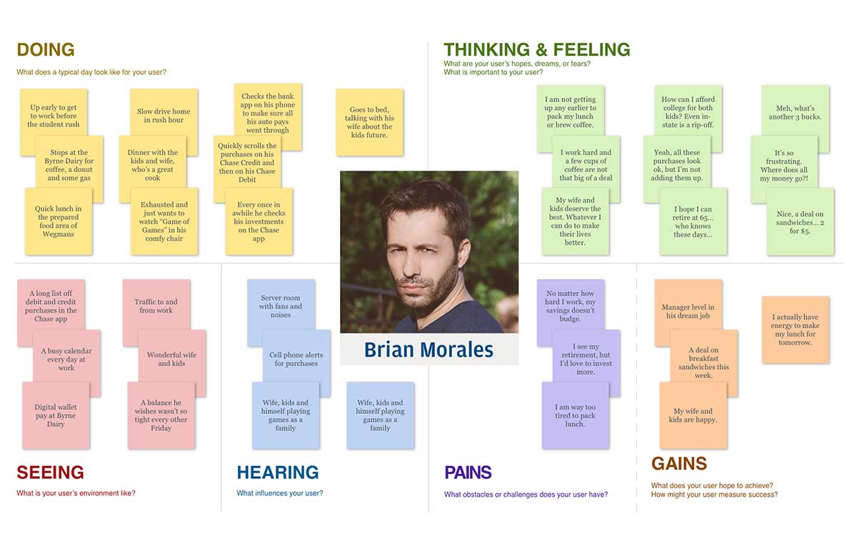
Empathy Map 01
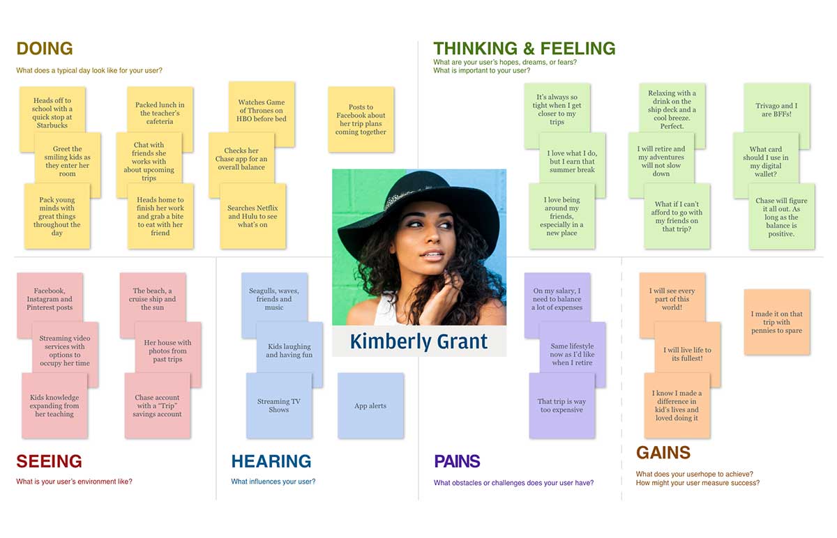
Empathy Map 02
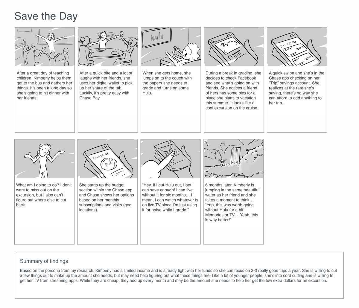
Storyboards
The data I collected showed that there were two groups that I should focus on and how they viewed saving and spending. I created my personas for each, and their unique stories developed in two distinct directions. I was starting to think about how the app would satisfy each group but also cater to those that may have an overlap in ideas.
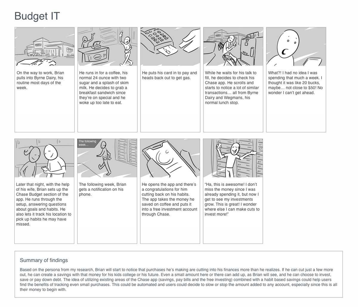
Storyboard 01
Storyboard 02
How Might We…

I knew the general idea for the app but the data was posing so many questions around the user that I decided to take the How Might We approach and see what came about. I broke down the main user needs and pain points and thought about how to solve them in a helpful way. It didn’t take long for areas of the app to emerge as I went through this exercise.
Information Architecture
Integration
I was at the point in the project where I had to think about how the new feature, I was developing was going to fit seamlessly into the existing Chase Mobile app. One thing I noticed as a user was how great functions were buried several taps deep. I wanted to bring this to the forefront so users would feel like it was easy to get to, didn’t take a lot to get the full picture and made it useable for everyday use.
Site Map

Ideate
Doodle and Flow
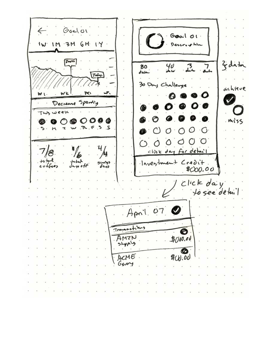
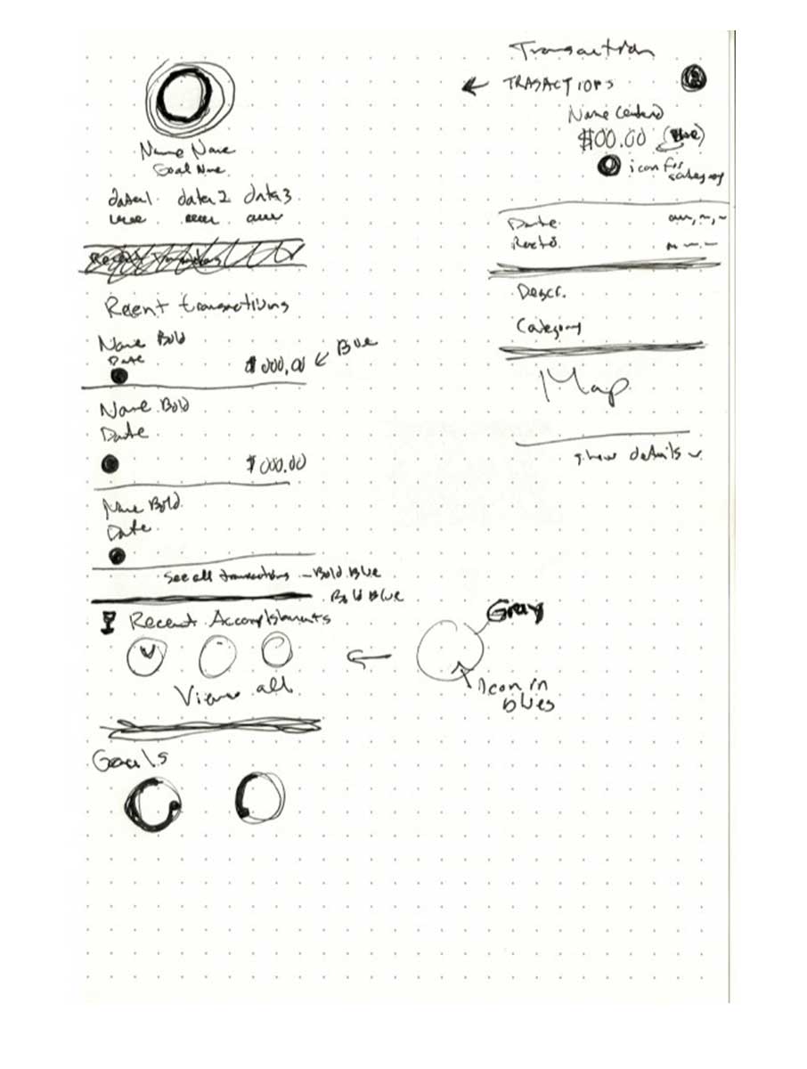
I started creating some drawings based off of the How Might We information and the idea that creating simple interactions could solve the setup process for users. I also knew that I wanted to add some level of accomplishments within the app so the users felt like they were getting frequent pats on the back. I thought of a 30-Day Challenge, Achievements/Goals and quick view rings to show progress for savings or investment goals.
The task flow was designed around setting up a goal and making sure purchases were categorized properly. Without depending on visuals, I knew organizing with icons would be a great use for most users. As for the user flows, each was drastically different since my personas had different needs and pain points, but in the end they could solve their individual desires in the same app.
Initial Sketches
I used the How Might We information and my personas to work on quick sketches for the app feature. I focused on keeping the same look and feel and how existing features could become amplified by the savings feature I was adding.

Sketch 01
Brainstorming ideas for the on-boarding process, cards, quick view progress, goals and tracking purchases.
Sketch 02
Sketch 03
Task and User Flows
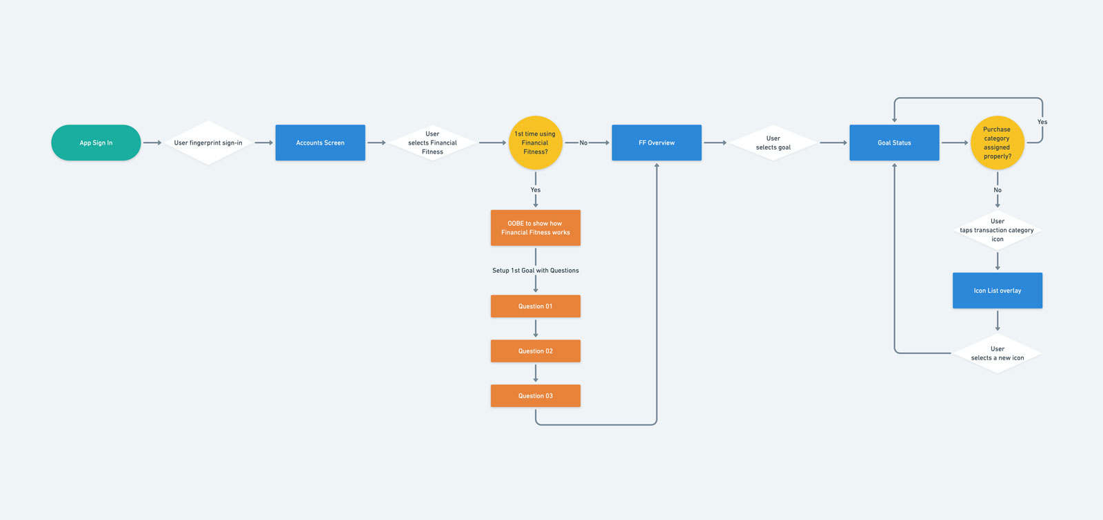
Chase Task Flow
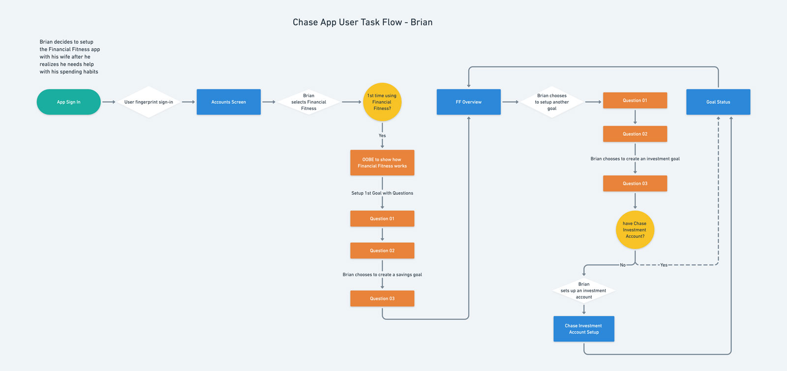
Chase User Flow - Brian
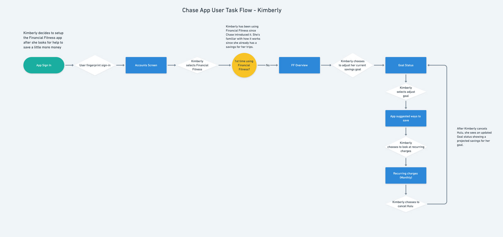
Chase User Flow - Kimberly
Wireframes
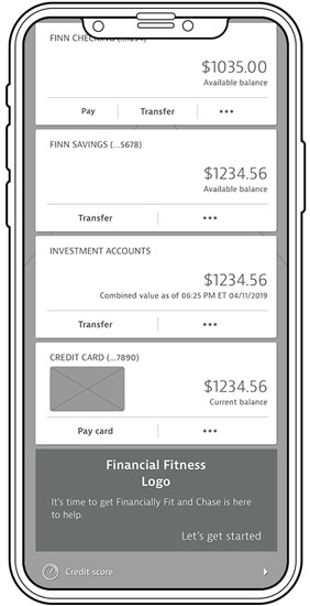
Financial Fitness Login

Financial Fitness Onboarding
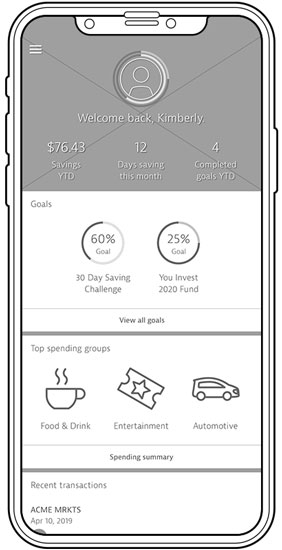
Financial Fitness Summary Screen

Financial Fitness Category Change

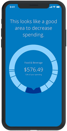
Financial Fitness Spending Breakdown
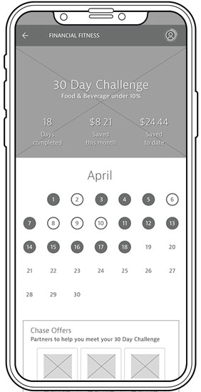
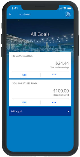
Financial Fitness 30-Day Challenge
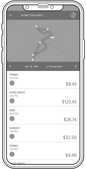
Financial Fitness Daily Spending
Style Tile

Chase has a well developed brand so it was imperative that I match the design perfectly. I made sure iconography was consistent and photography style was used properly.
Responsive UI

Login
Financial Fitness Onboarding
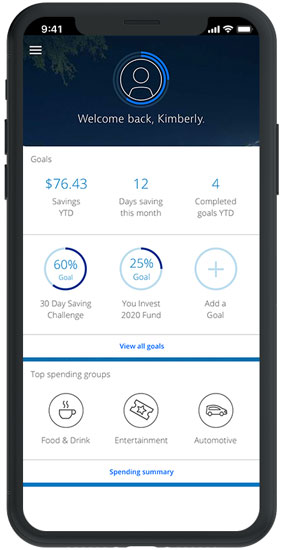
Financial Fitness Overview Screen
Financial Fitness Goals

Financial Fitness Spending Overview
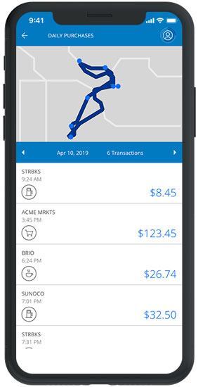
Financial Fitness Daily Spending
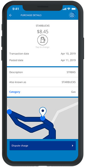
Financial Fitness Detail

Financial Fitness Add a Goal

Financial Fitness 30-day challenge
Test
Testing and Revisions
The prototype for the Financial Fitness feature was built within Sketch and delivered on a mobile device. Participants were given 4 scenarios consisting of 4 tasks, which included completing the onboarding, changing a purchase category, checking accomplishments and starting a new goal.
After the completion of testing, the overall response was very positive. There were a few areas of concern where users stumbled, which were addressed in the revisions.
Affinity Map

Next steps
Evaluate and Iterate
Through user testing, I found that most people were interested in adding investment possibilities as a goal. Research and testing could be done around incorporating Chase’s existing investment feature (You Invest). I also found that users who had the Chase app on their phone were interested in the Spending Summary wheel and utilizing its functionality, so testing for possible functionality or alternate uses will be something to investigate. Overall, keeping the feature easy to use, transparent and also finding the path of least resistance is the focus for any update.