PMI – Make Reality
Bringing Changemakers to PMI
The Project
PMI collaborated with an advertising agency to initiate the Make Reality project in 2020. The process was slower than expected, missing a few key dates, so in late 2020 the project was shifted internally. There were three of us assigned to the project; a Visual Designer, Product Owner and myself, taking on the UX and Interaction Design role. We ingested all of the designs and made considerable adjustments to create a story and flow to the site. We also addressed the UX, which was poor due to the lack of research. It was on the three of us to make up lost time as well as creating an impactful site the Brand Team had been expecting for almost a year.
Project Goals
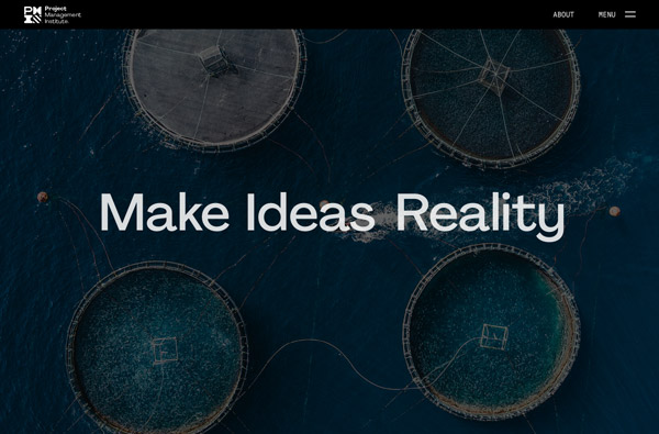
To create an engaging microsite that draws in a younger group of professionals, educating and entertaining them while building a relationship with PMI. The site needs to be focused on a global audience.
Role
ux designer, motion graphics designer
Sktch
Ae
Frmr
Timeline
6 months to live with 2 week sprints
Ramp up
Assessing the Pieces
There were only a few pieces to this project that came from the agency. Not that anything was withheld, rather they didn’t account for so many scenarios, including: research data, mobile designs, ADA compliance, consistent user experience, etc.. There were a lot of complexities to think through with little to no guidance from research data.
The first thing we did was talk to our researchers and try to gather some data that we could use to make informed decisions. With that, we knew we could look at what was given to us by the agency and make adjustments or just start from scratch. We had a years worth of work and only 6 months until launch.
Initial Design Analysis

Sketch Designs
Moving to Sketch
While moving to Sketch, I made the effort to look for areas of improvement and missing elements, such as a navigation for the microsite (yes, there was no navigation in the initial design). I also wanted to make sure there was a flow to the page that would tell a story and engage the user. I set standards for how elements would overlap, story layout and more. As I updated the site with these rules, a really interesting idea started to take shape.
High-Fidelity Designs
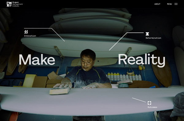
Scrolling Animation
Scrolling Animation
Navigation
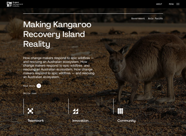
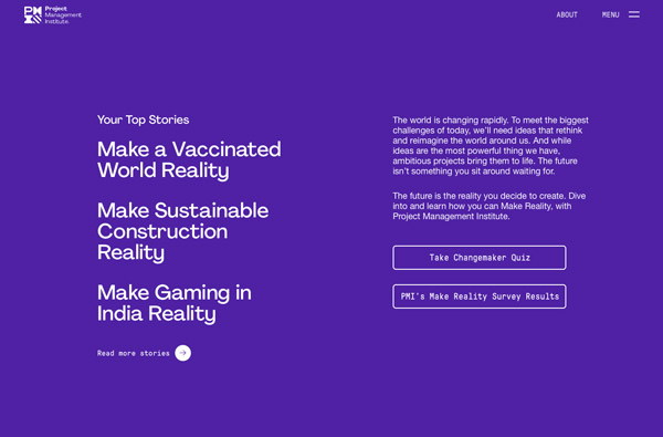
Make Reality Stories
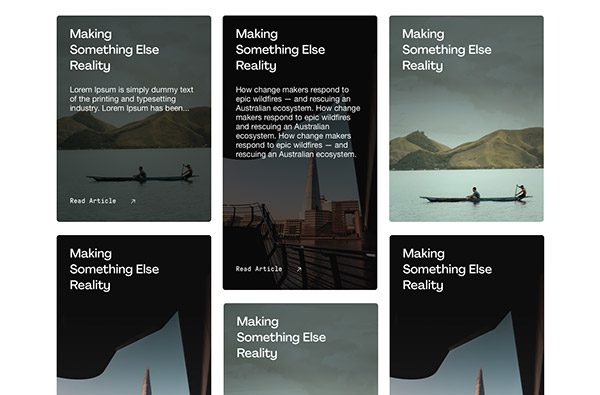
More Stories
Prototype
Getting Dev Involved
Early on I started meeting with two developers about the project. I wanted to make sure they felt comfortable with the design since this was the first time PMI was creating a site with scrolling effects and other interactive items. I would meet weekly, sharing the latest Sketch file and explaining what we were thinking, but asking them to give estimates on stagnant screens was not enough. We all decided that a prototype would be the best solution to truly understand what was being asked. So off to Framer, I went.
Framer Prototype

Side Note – This was the most complex prototype that I built within Framer up to that point. I definitely stretched my knowledge, learning to code more efficiently while pushing the app to get exactly what I wanted.
Next steps
Evaluate and Iterate
We were able to launch the Make Reality site on the date that Brand had set for it’s initial campaign. The reception was even better than most expected, but we knew there were areas to iterate and improve on to fully realize the goal of the product. Within weeks we had gathered some amazing analytics and user feedback that helped us focus on what to tackle first. For more on that, check out this page.