Simply Distressed
Bringing high-end to a small business
Salvaging old furniture and repurposing it has become a fairly popular style. Because of this trend, those selling their furniture have to work hard to carve out a space for their product. With many sellers using social media or co-op shops to push their work, Simply Distressed was looking to find an alternate route to acquire customers.
The Project
Simply Distressed is a Sevierville, Tennessee custom painted furniture company that was looking to break out beyond Facebook. Most of their clients were focused on mobile, and social media and in need of delivery options if they did find a piece they wanted to purchase. In a very competitive field, they needed a way to separate themselves so they could rise to the top.
Project Goals
To design a social media app focused on augmented reality that is more than a gimmick and brings friends together even when they’re far apart. To build a safe and fun app to share or create experiences among users.
Role
user research, UX designer, UI designer
Xd
Ai
Timeline
2 weeks
Ramp up
Let’s Get Started
Having an initial conversation with the owner of Simply Distressed, I knew he wanted to step closer to the feel of a professional, high-end furniture site while still retaining the roots feel of Tennessee. I started with an analysis of direct competitors and companies that exuded what he wanted to represent.
There was a drastic difference between large custom furniture companies and the small custom businesses that Simply Distressed competes with. Larger companies were organized, focused on the experience of building a custom piece and had a clean, responsive web presence. For smaller businesses, social media was the main focus which were hard to check availability, had outdated information and made the overall experience feel confusing. It was clear from the start that social media had a place, but not as a serious market for Simply Distressed.
Competitor Analysis

Research
Research Methodologies
Questionnaire – I created a series of questions based around the desire for custom furniture, but also focusing on the experience of picking out the right piece. I also touched on areas of style, impact of social media and what devices participants used to shop.
Competitor Analysis – I conducted extensive research of large custom furniture businesses as well as direct competitors to Simply Distressed. I analyzed how the products were presented for purchase, overall presentation of products and options given to potential customers.
Subject Matter Expert – I spent several hours speaking with the owner of Simply Distressed about his business and customers, the custom furniture business and the background of the style. I also spoke with custom furniture painters who either created their own furniture or salvaged pieces.
Needs
%
Needed custom or recycled furniture, proving the style is in demand in the area
%
Used social media to look for design inspiration
Pain Points
%
Find it difficult to purchase furniture without a delivery option
Wants
%
Looked to support local business when deciding to purchase furniture
%
Sought out eco-friendly options when making purchases
Define
Research Synthesis
I was able to push the questionnaire through Simply Distressed’s Facebook page, which gave me results specifically from custom furniture shoppers. I found that social media was a key area for discovering furniture but also proved to be a pain point for most participants. Overall, participants wanted an easier and more reliable way to find custom pieces.
Persona

Empathy Map

Information Architecture
The data I collected started directing me towards a user who was a casual shopper, but also focused on filling a specific need. The user would know what they wanted when they saw it and would act upon it. This had me thinking about how inventory, specifically for one-of-a-kind pieces, would develop. There had to be a better solution than a Facebook timeline.
Storyboards

Sorting It Out
I wanted to investigate how potential users viewed custom furniture, so I created an Optimal card sort with several types of furniture, finishes and ideas, most from conversations I had with the owner of Simply Distressed. I discovered how users may sort products, which helped with the next step, the site map.
Keeping the data and persona in mind, I created a site map that focused on simplicity and organizing work based on availability. Another area of importance was community, which was the inspiration for the local blog and how the owner of Simply Distressed could relate with everyone nearby.
Card Sort

Site Map

Ideate
Doodle and Flow
I began drawing ideas for several pages, including the home page, product pages (in-store and previous projects) as well as the blog. These pages had a clean layout, but also supplied the potential customer with vital quick information like an image, price, availability and product type. This solution was already tackling a major pain point – searching for a product at first glance and making sure it was available for purchase.
The task flow was designed to show a purchase and how it would immediately affect inventory by marking it as sold as well as letting a shopper pay via PayPal or another outside source. The user flow added a level of customer service, which the data showed was important so shoppers could ask questions and get quick feedback.
Task and User Flows
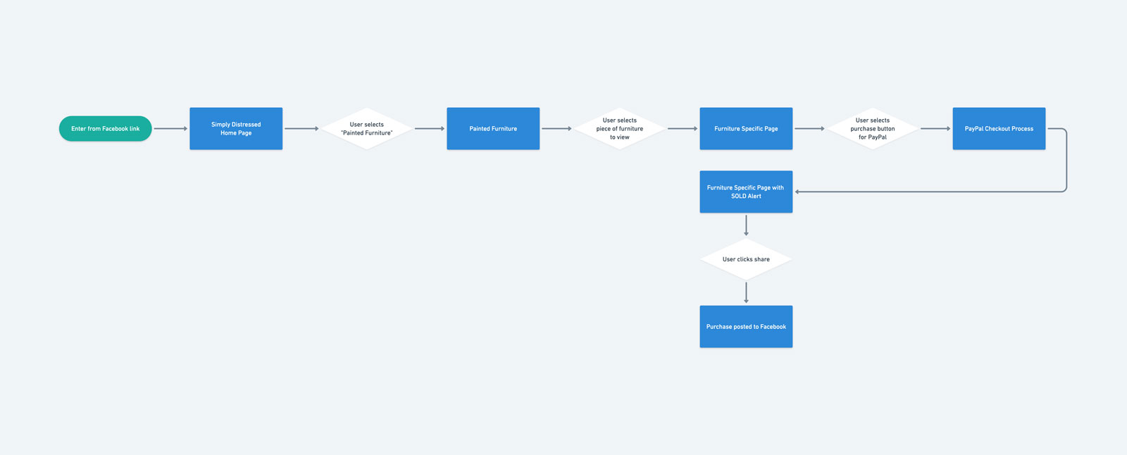
Simply Distressed Task Flow
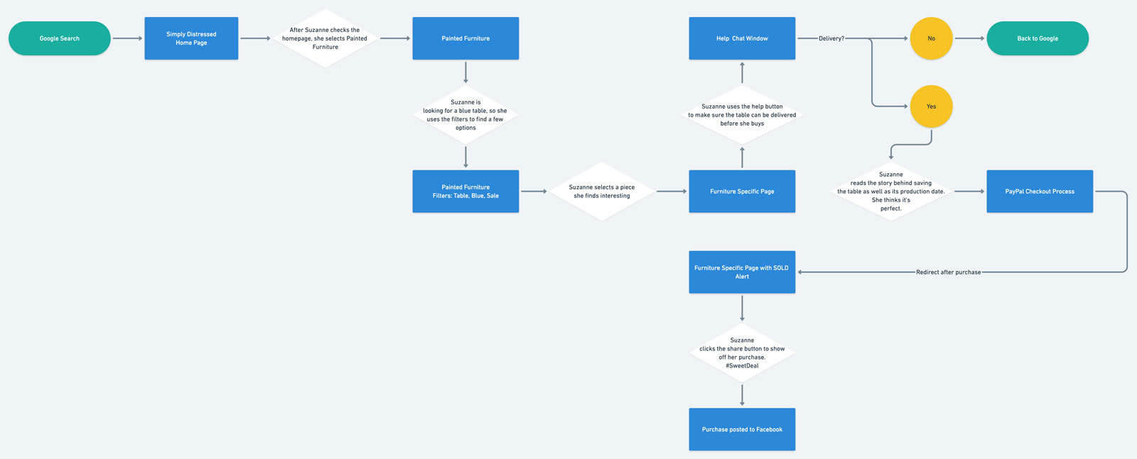
Simply Distressed User Flow - Suzanne
Initial Sketches
Once I knew the structure of the site, I dove into initial sketches to help tackle the largest Needs, Wants and Pain Points the data reflected. I knew filters would be ideal and I didn’t want to reinvent the wheel for the target audience. I also knew social media was very important so I thought about how to add a live feed in case that would help push information and sales.
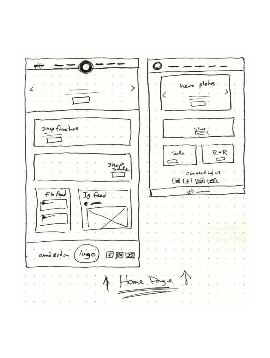
Simply Distressed Home Page
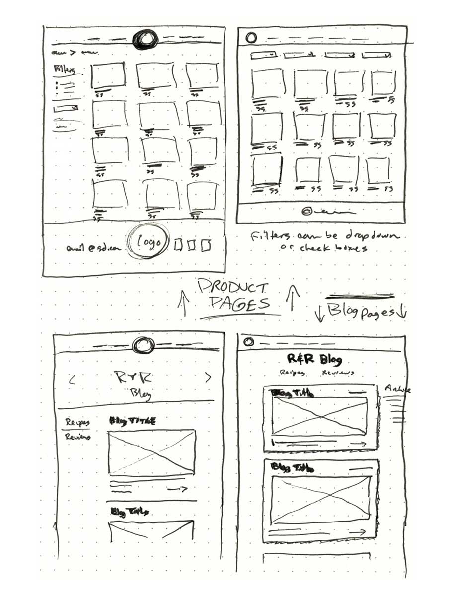
Simply Distressed Product and Blog Pages
Drawings to work out product pages and blog. Filter ideas based on familiar patterns to help users find items quickly.
Wireframes
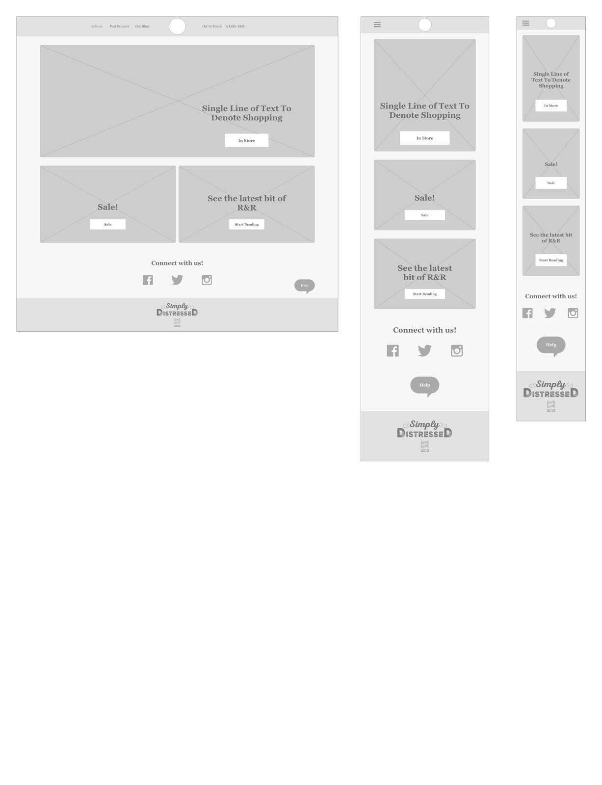
Simply Distressed Home

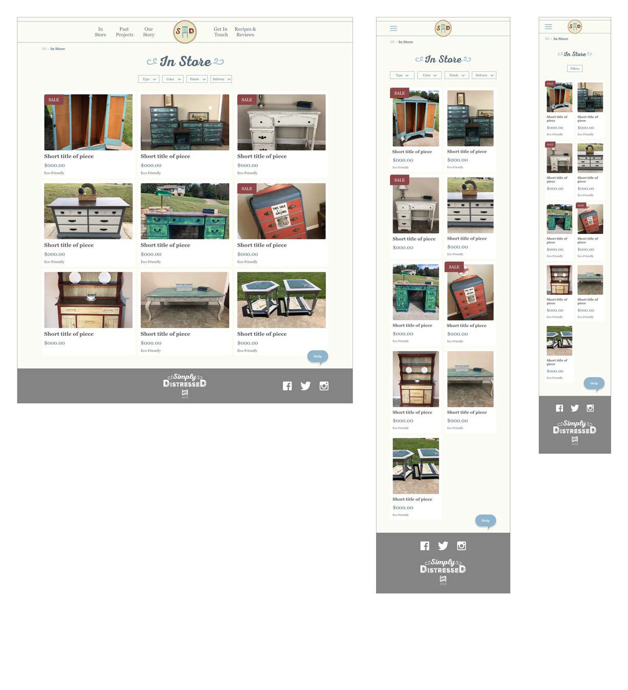
Simply Distressed In Store Page
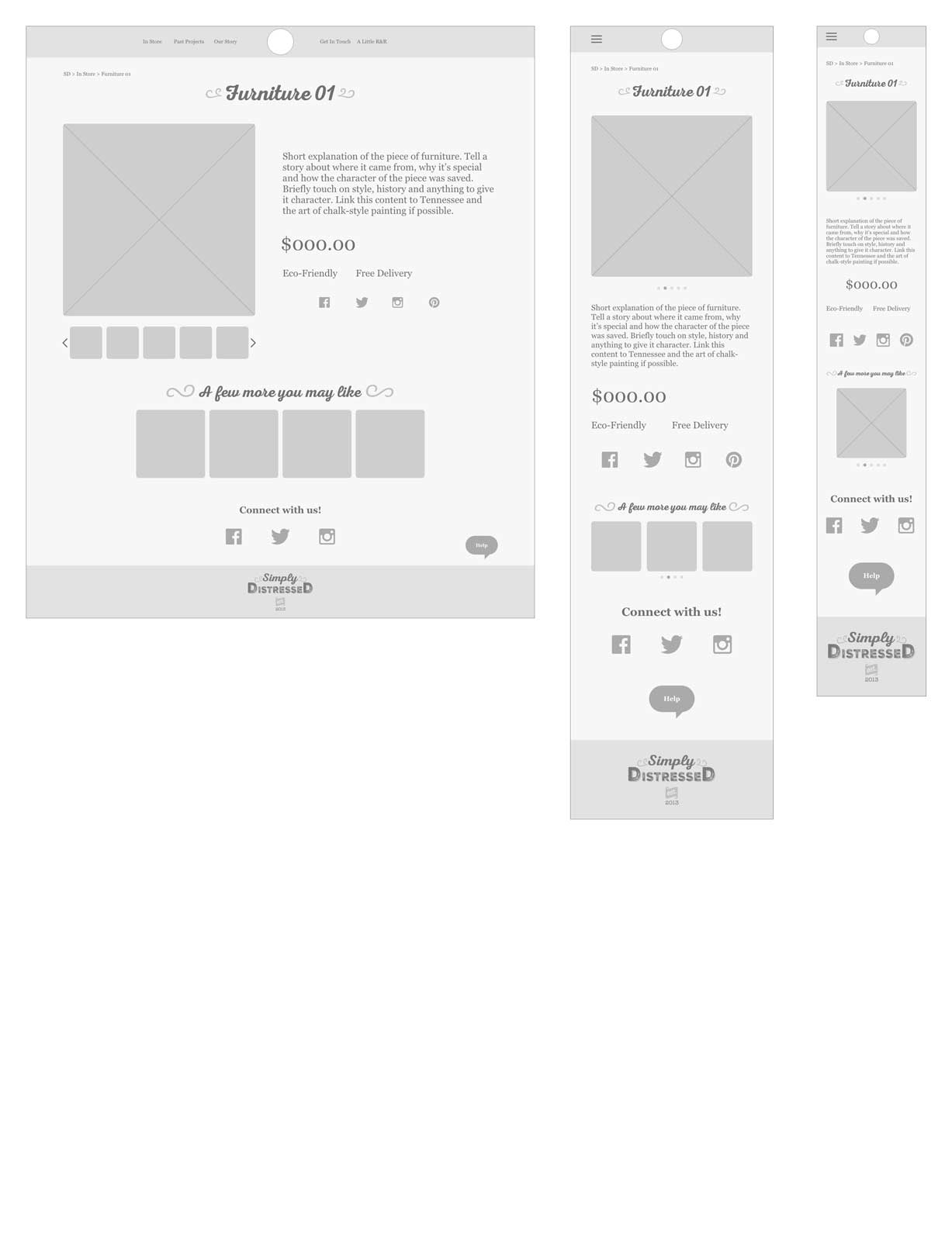
Simply Distressed Furniture Page
The page has a carousel to show several shots of the furniture as well as a description to help tell the story. The ability to share on social media is also available since that is an important aspect for the persona.
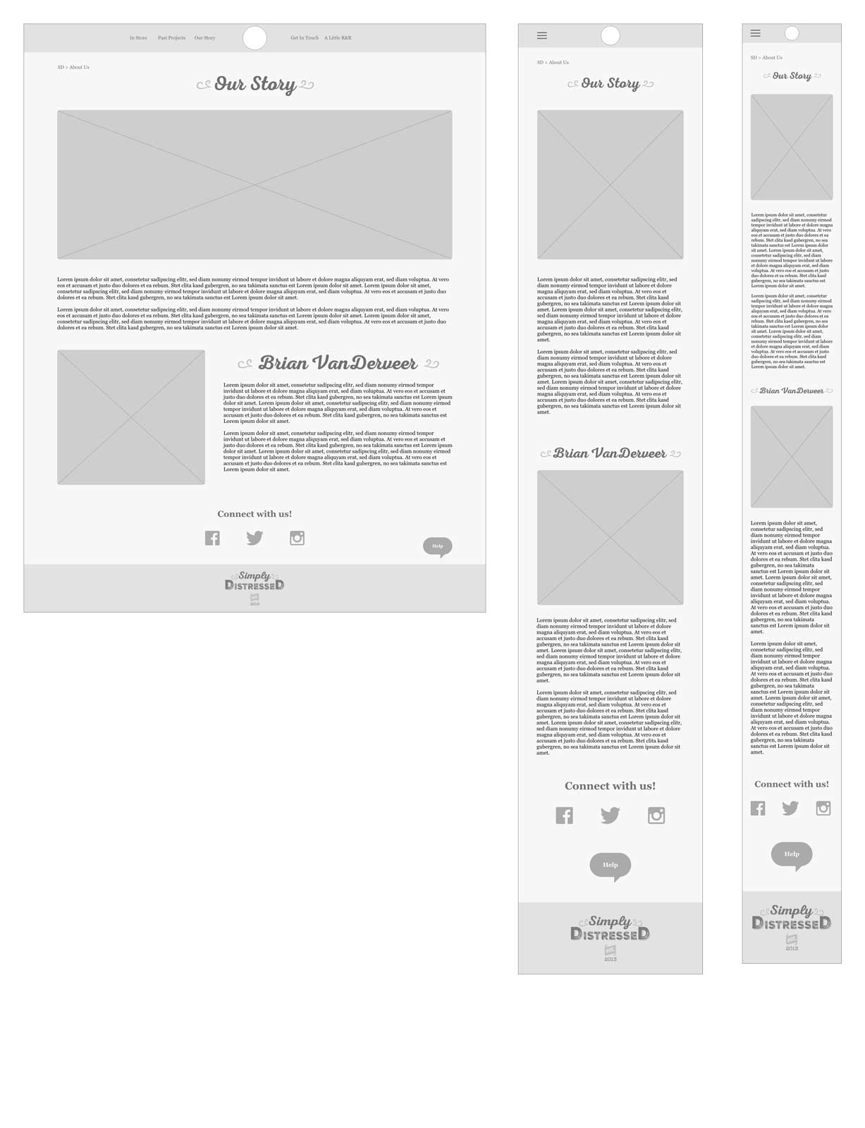
Simply Distressed Our Story Page
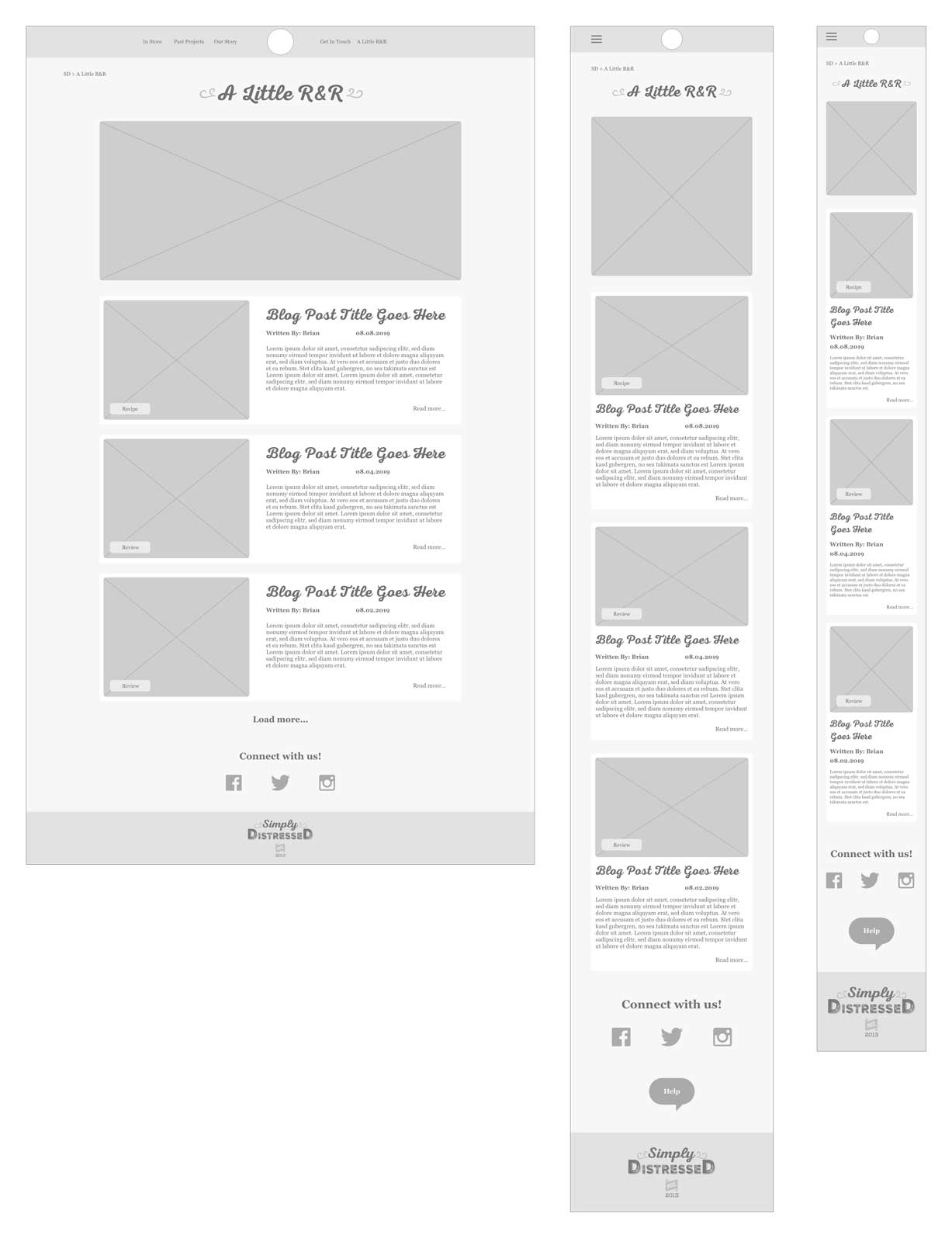
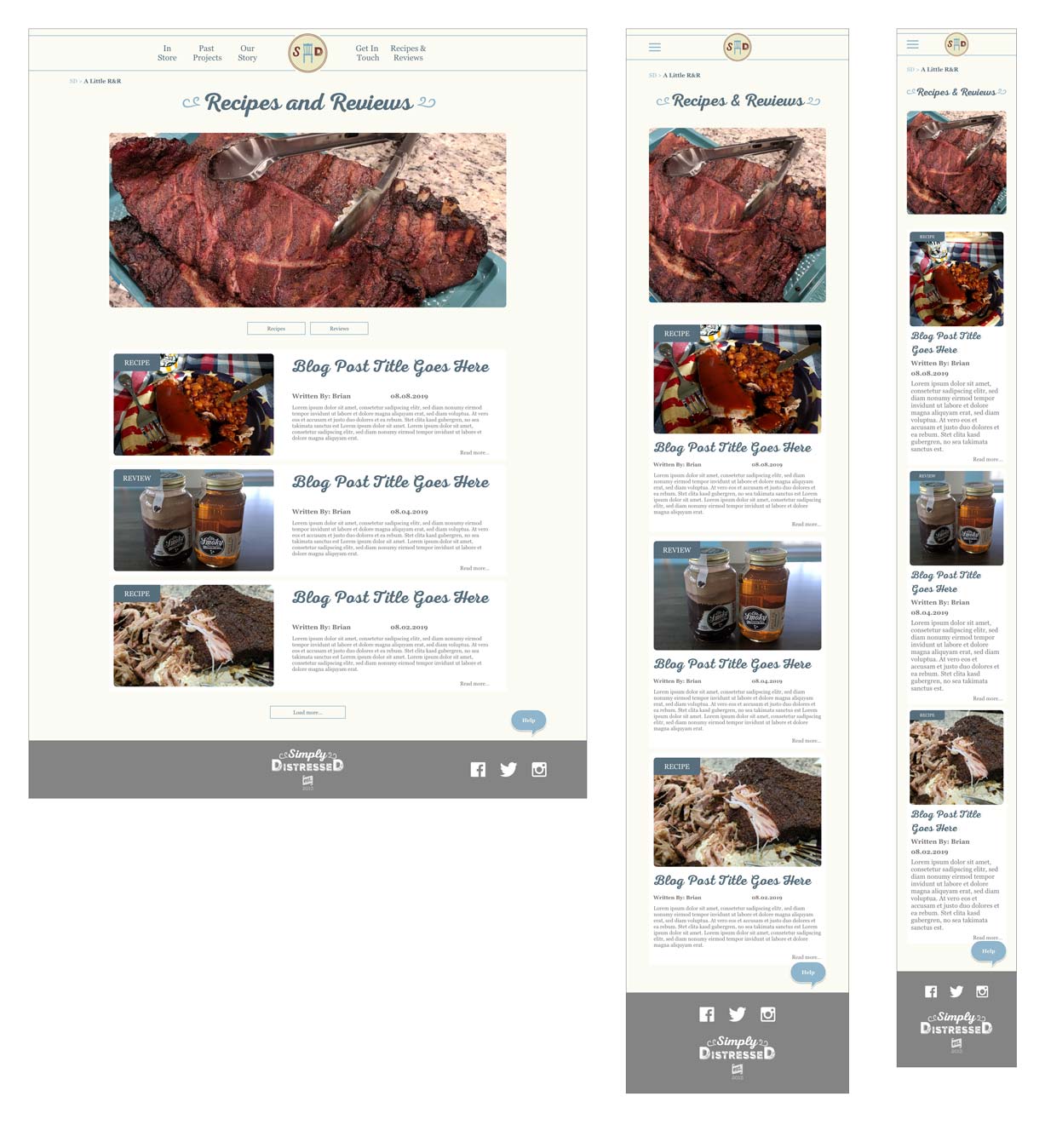
Simply Distressed R&R Blog
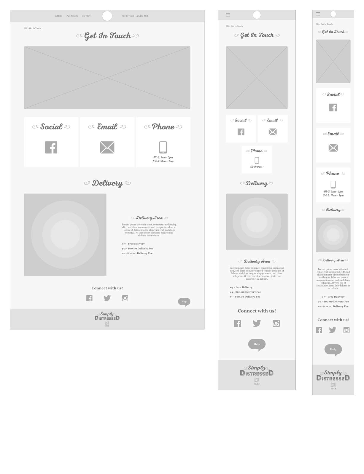
Simply Distressed Get In Touch Page
Wireframe Prototype

I built the prototype within XD to help test the usability of the initial app idea. I focused on mobile since the data was showing that the majority of potential users were using their phones to shop.
I tested the ability to find the store, filter an item and then return through the menu. I discovered a few areas I needed to address, such as button labels and onscreen information for products. These were important discoveries before I went into the UI phase.
Mood Board

Simply Distressed had existing branding so the overall look and feel was worked through a mood board. Clean, staged images were the focus for showing the custom furniture so it felt more professional and less like a mobile phone shot rushed to a Facebook post.
Responsive UI

Simply Distressed Home Page
Simply Distressed In Store Page
The currently available pieces with filters to narrow down selections.
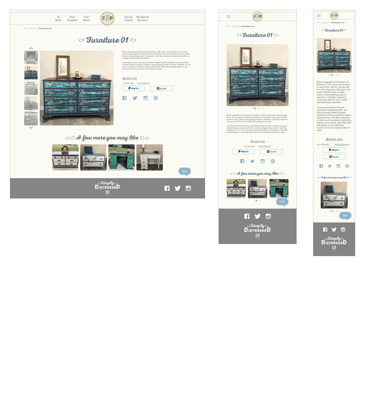
Simply Distressed Furniture Page
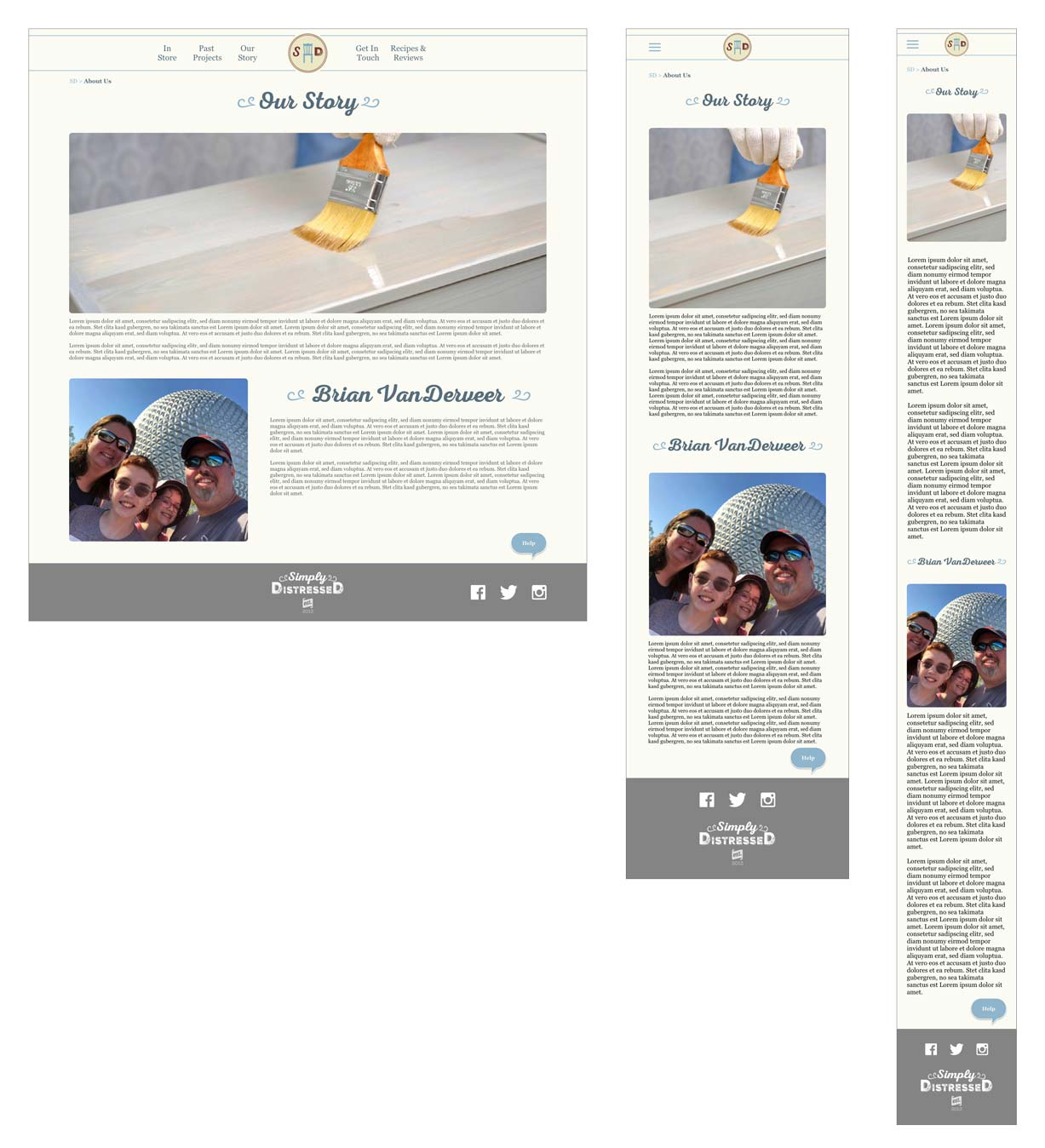
Simply Distressed Our Story Page
Simply Distressed Blog Page
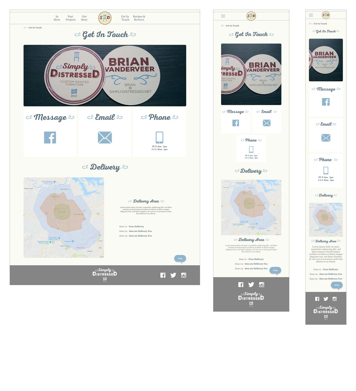
Simply Distressed Get In Touch Page
Test
Testing and Revisions
The prototype for user testing was built in XD since the functionality fit the site well. I expanded on the original user testing from the wireframes, but the core test was making a purchase and checking on delivery.
Overall, testing went very well and there were minimal revisions to complete. Most adjustments consisted of wording changes for the CTAs.
XD Prototype

XD proved to be a good choice for the prototype since it was fairly straight forward and no gestures were used outside of the norm for navigating a webpage on a phone. Participants found the prototype to work very well, which helped with the error-free rate.
User Testing Results
Based on the user testing, the participants met or exceeded the expectations for completion of the tasks. Users were able to complete all the tasks and were able to improve their navigation by the end of the test.


The error-free rate exceeded expectations with users finding the patterns familiar and easy to use. There was an issue with XD during testing which led to two users having issues with the same part of the task, navigating to the delivery information.
Affinity Map

Next steps
Evaluate and Iterate
Through the user testing, I found that imagery was a major factor for most decisions. It was important that users have clear imagery on the pages where they were looking at multiple items choices. If an image wasn’t clear, they didn’t look closer, they simply ignored it and were often put off by it’s lack of professionalism. In an area of sales, like this site, it is a main focus to create pleasing imagery, which will be a focus moving forward. I also found that users wanted clear and concise text because they didn’t want to think about it, just go and explore. Moving forward, the plan will be to evaluate text and make sure it is focused while still staying with the tone of Simply Distressed.