ARcadia
Bringing people’s experiences together
Social media is a major part of people’s lives, many checking in throughout the day to stay in touch with family, friends and the world. Living vicariously through a connection’s words and imagery, people can consume snippets of the outside world. A reasonable next step would be social media users getting out and becoming part of or adding to those events.
Project summary
The idea behind ARcadia is to approach social media from a more communal aspect and less of a voyeur. ARcadia uses geolocation and augmented reality to tell stories, create interactive experiences and bring friends and family together even when they’re not nearby. Users will drive the content, interact with and explore posts all within a safe app that allows them to easily decide who sees what posts and when.
Project Goals
To design a social media app focused on augmented reality that is more than a gimmick and brings friends together even when they’re far apart. To build a safe and fun app to share or create experiences among users.
Role
user research, UX designer, UI designer
Sktch
Ai
Prto.io
FrmrX
Timeline
2 weeks
Ramp up
Let’s Get Started
Heading into this project, I knew social media as a whole was just fine but I wanted to look into the pain points where users felt social media was letting them down, where it could improve and how it could potentially take a step forward… and AR was peeking around the corner at me.
The first thing I knew I needed to do was a thorough analysis of the social media giants, check to see if and how another app was thinking about AR and any other apps that may be thinking about a more communal social media aspect. It wasn’t hard to fall down a serious rabbit hole of research at this stage.
Competitor Analysis

Research
Research Methodologies
Questionnaire – I developed a series of questions focused on how people use social media, why they choose particular apps and what pain points they may have. I also looked for trends in different generations and the difference in how they use and perceive social media.
Competitor Analysis – I researched numerous social media apps including several apps that focus on AR, popular social media apps as well as fringe apps and why their users continue to participate.
Secondary Research – I conducted extensive secondary research in AR and social media since they are still a rare combination. I looked to opinion articles, research and areas that focus on the future of social media combined with AR.
Needs
%
Need to be connected with those close to them
%
Would go out of their way to visit a location posted by a friend or influencer
Pain Points
%
Aren't sure what to do with AR
Wants
%
Want the option to use their voice about a business or location
Define
Research Synthesis
At this point, I had some amazing data from 220 respondents that was pointing me towards a handful of things, the most important was my core audience and how they used social media. I realized I was going to have two very different demographics to aim for and the way they viewed and used social media was quite different. I created personas based on the data I collected, focusing on their specific needs, frustrations and motivations. I was also aware that the groups I chose were open to trying out this thing called Augmented Reality, but there was very little out there to show them what they could truly do with it.
Personas
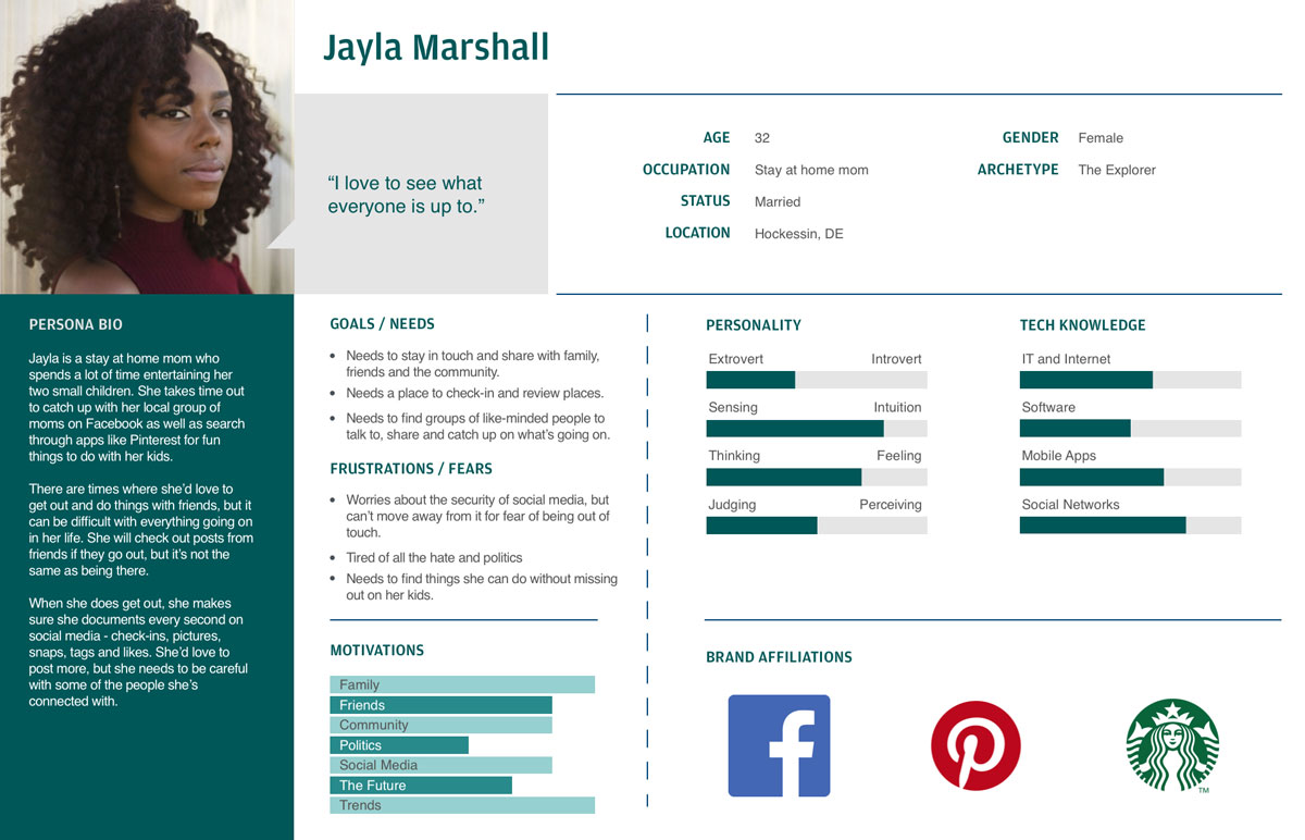
Persona 01
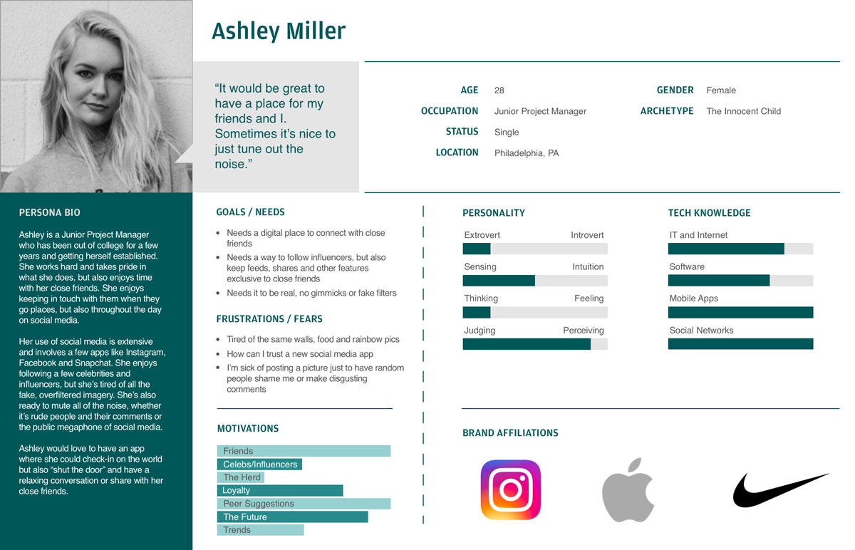
Persona 02
Empathy Maps
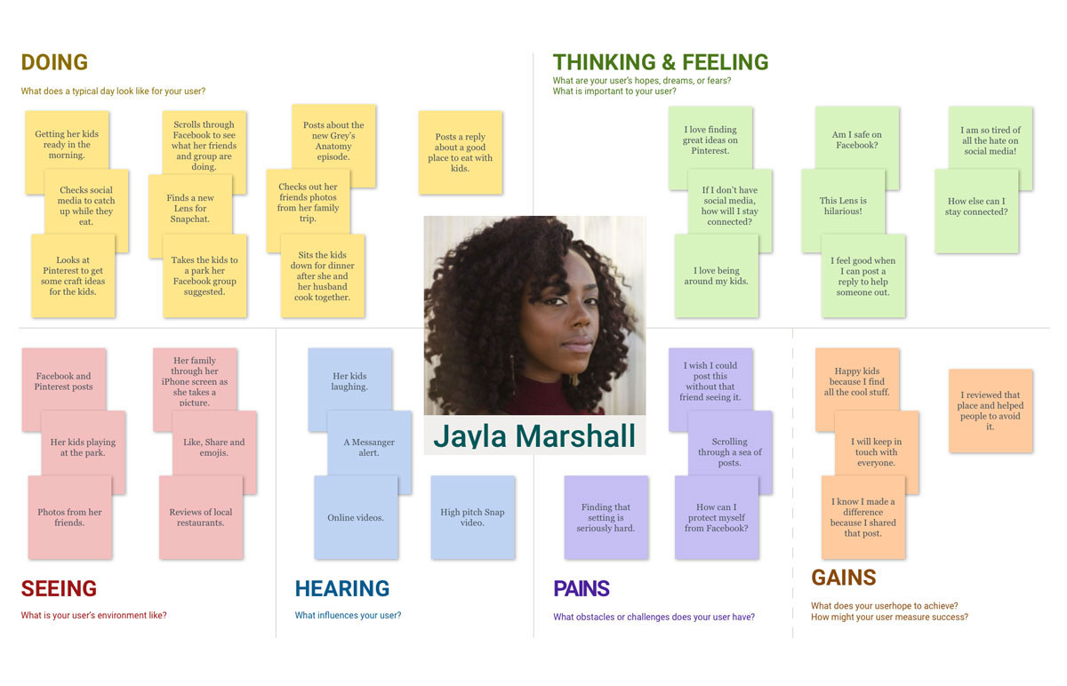
Empathy Maps 01
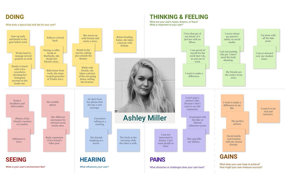
Empathy Maps 02
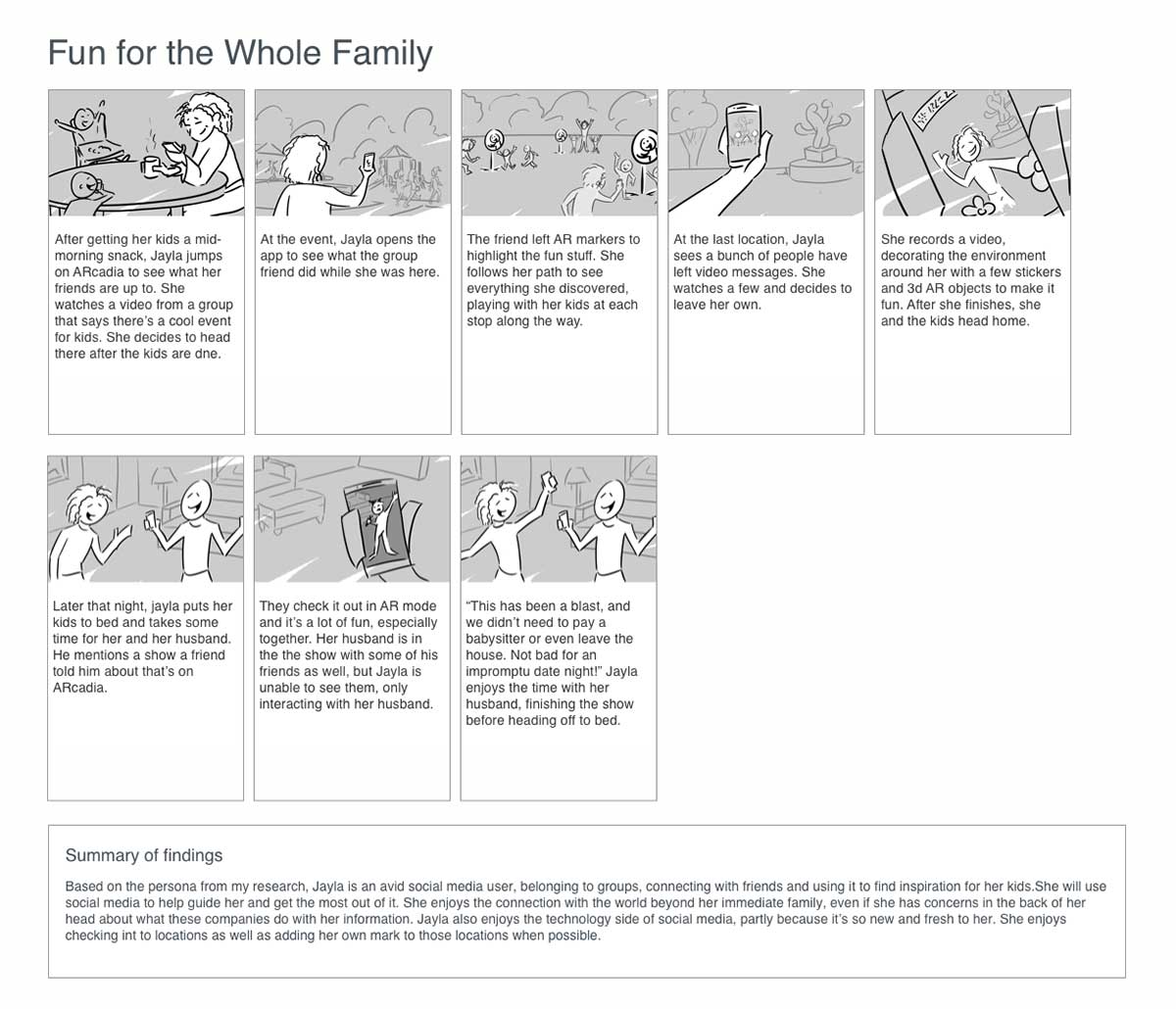
Storyboards
The idea was starting to come into focus a bit. I didn’t have exact designs or functionality, but I started to see what the personas needed to start addressing their pain points. The storyboards became a highlight of the process for me and actually started the way forward for discovering the core functionality.
Storyboards 01
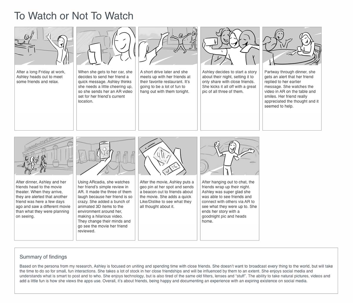
Storyboards 02
How Might We…

So, I had some vague solutions and a bunch of needs for my personas, but how do I bridge the gap to actual ideas? What did my app need? A cool technique that I learned from my mentor was asking the question “How might we…”, which forced me to look at needs and pain points and ask how I can come up with a solution. This created a flow for me to start thinking about solutions for both of my persona’s frustrations and open the door to unlimited solutions.
Ideate
Doodle and Flow
I found myself in need of some inspiration because how I saw an AR app work wasn’t a typical interface. I decided to use a technique that was suggested to me by my mentor and it ended up guiding me to discover designs I wouldn’t have reached if I was overthinking it. Sometimes those ideas are locked away somewhere and doodling them out without thinking is the only way to find them.
Creating a bunch of quick drawing ideas in a short amount of time really had me thinking about my personas… What did they want? What did they really need? How can I address their pain points? I approached my user flows and wireframes thinking about simplicity, connectivity and freedom. I started realizing the core to this app was the camera and to keep it simple, which the data guided me towards, I had to make sure the user always had it at the ready.
Task and User Flows
ARcadia Task Flow
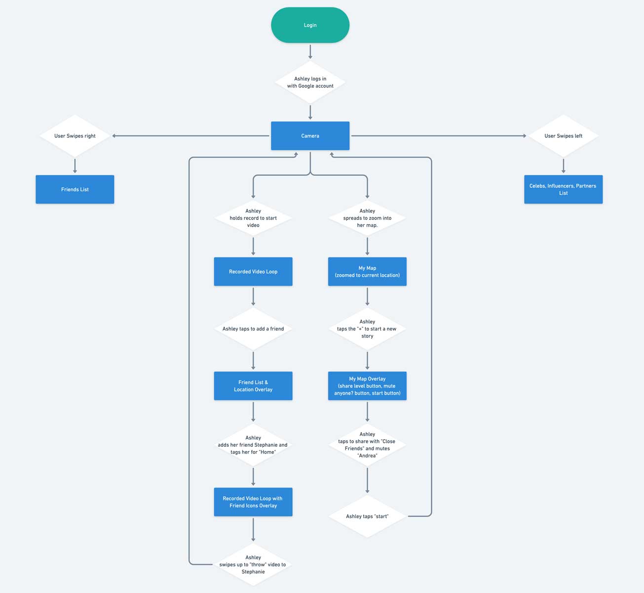
ARcadia User Flow - Ashley
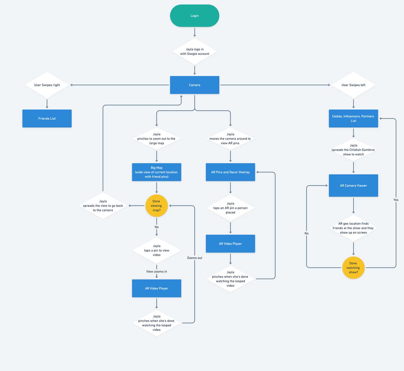
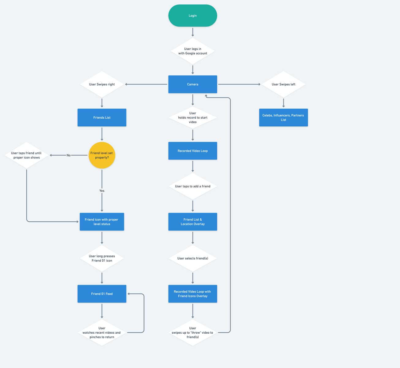
ARcadia User Flow - Jayla
Jayla is more focused on socializing with groups outside of her family where she can use the app to entertain herself and her kids. She tends to use the app to scavenger hunt or play user created “games”.
Crazy Eights
As a brainstorming exercise, I used a technique called “Crazy Eights”. I tried to come up with 8 distinct drawings in 8 minutes for several areas of the app, focusing on the main components, like the friends list, influencers and settings. What I originally thought was a good idea for certain screens in the app ended up being put aside for a version of the quick sketches I did.

ARcadia "Friend" List
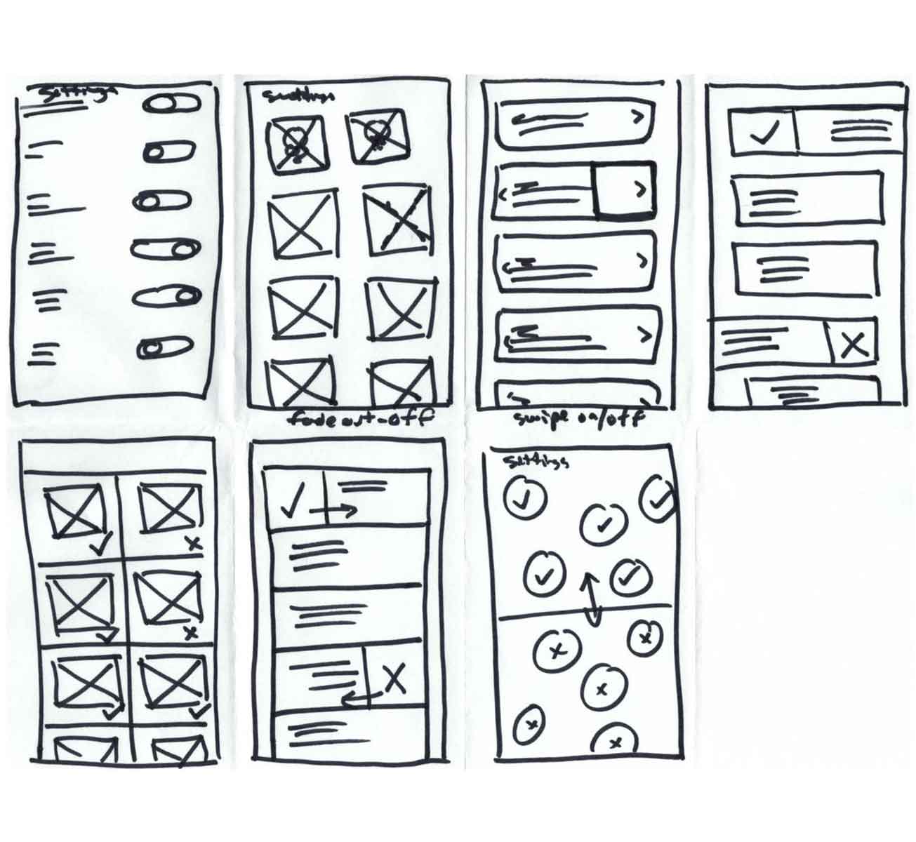
ARcadia Settings
Wireframes
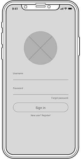
ARcadia Login
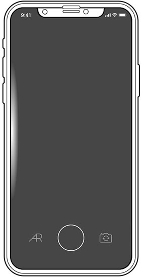
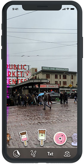
ARcadia Camera
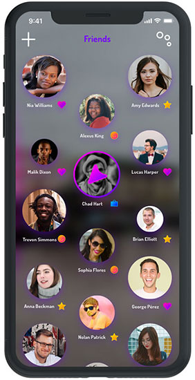
ARcadia Friends
ARcadia Influencers
ARcadia "My Time" Map
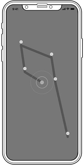
The user’s map displaying the their current journey/story and areas where they left AR videos, pictures or objects. It is viewable by groups the user selects (.e. – friends and higher).

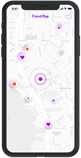
ARcadia "Friend" Map
The friend map displaying the user’s friends and locations where those users posted AR pictures, videos or objects. Each pin or icon can be clicked on to view items.
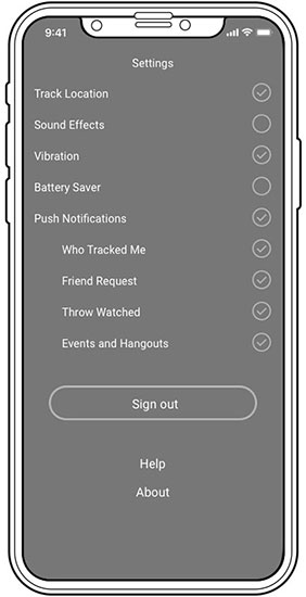
ARcadia Settings
ARcadia Login
ARcadia Camera
Logo Design
ARcadia Logo Sketch 01
ARcadia Logo Sketch 02
ARcadia Logo Sketch 03
I moved over to Illustrator since I felt that I could duplicate and make minor alterations quickly. I liked a pin idea (top left) and started thinking how that could be incorporated. I started to realize the idea I had for a friend’s image size shrinking based on post time would work well with the pin size in the logo.
ARcadia App Icon
I’m a big fan of doodling. I use a Micron and paper or even doodle in Illustrator or Cinema 4D. For the logo, I looked at some reference, but I ended up thinking about elements of the app as well as what I felt was the core idea – bringing people together in a space. I just kept going and ended up with a great idea in the end.
Logo Design

With the data pointing towards a younger, more vibrant user, I chose to focus on simple but colorful iconography and typography. This accomplished two things… users would be drawn to it and it would overlay live camera imagery very well.
Responsive UI
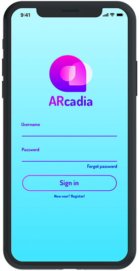
ARcadia Login

ARcadia Camera
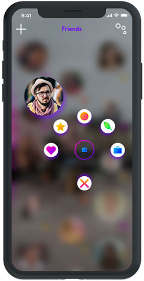
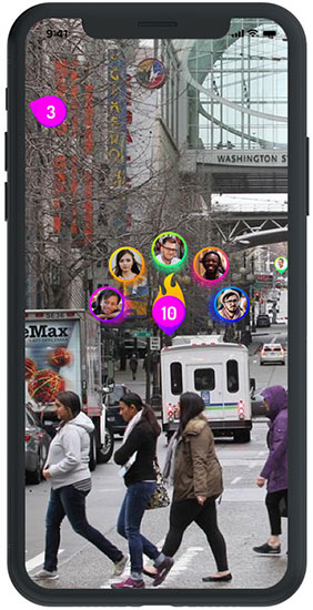
ARcadia AR Menu
The AR menu for placing AR options and recently used items over top.
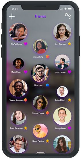
ARcadia Friends
ARcadia Friend Level

ARcadia Friend Sort
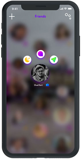
ARcadia Friend Options
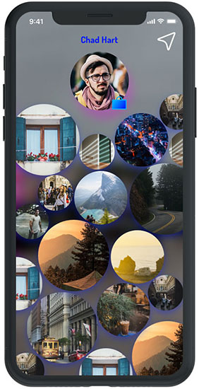
ARcadia Friend's Posts
ARcadia Friend Message

ARcadia "My Time" Map
ARcadia "Friend Map"
ARcadia AR Pins
ARcadia Login
ARcadia Camera
Test
Testing and Revisions
The prototype for user testing was built in proto.io specifically due to the ease of adding gestures, which this app design relies heavily on. Four users were recruited for testing on a mobile device, focusing on the functionality and overall appeal of AR in a social media app. Some animations and gestures were implemented into proto.io with a more comprehensive version completed in After Effects.
After the completion of testing, revisions were made to address issues for usability and overall flow based on user feedback.
Proto.io Prototype

After Effects Prototype
User Testing Results
Based on the user testing, the participants met or exceeded the expectations for completion of the tasks. Only one user failed to complete a task in full. This was a good sign for the app design, but the level of errors gave me a lot more information to address.


The error-free rate fell below expectations, but it gave me the insight about how usable my app was in its current state. Users had issues with certain long-press interactions and the iconography used for those areas. These were important discoveries that led to updates for the app design and functionality.
Affinity Map

Next steps
Evaluate and Iterate
The first round of design was used to determine the basic functionality and proper use of the ARcadia app. With the feedback that I received during user testing, there are a few items that need to be updated and tested again, such as iconography for the sorting of friends as well as the gestures for seeing the user’s map or friend’s map. From there, the next sprint will include a few more functions and how they will incorporate into the current state. These may include events in AR, virtual meetups or photos and other social aspects that fit the AR-focused app.