Vanguard Reporting Tool
Clarifying a powerful report tool
As I’m sure anyone can guess, Vanguard has quite a few clients. Running and organizing monthly reports can be tough enough, but what happens when a team wants to view a specific report or organize them? It can get overwhelming, for sure.
Project summary
This project was designed to assist different internal teams with searching, editing, grouping and other options for their monthly client reports. This is a desktop, web-based tool that was in need of functionality and UI updates. The tool was not just out-of-date visually, it also had redundant search functions across several pages, missing functionality for the core teams and was not very usable if you happened to be new to the team. I was asked to lead this project with a group of nine people, most of whom are users (new and seasoned). There were also 3 developers on the team that I worked closely with to make sure the project could be completed on time and within budget.
Project Goals
To create a better and more user centered experience as well as update the dated UI with a Vanguard approved Angular design.
Role
UX designer, UI designer
Sktch
Ae
Timeline
6 weeks
Ramp up
Getting familiar
When I came on to the project, it was very clear that the team wanted a better experience for everyone, even the users that had dealt with this tool for years. They were also switching to a different backend system which allowed more functionality and a smoother experience, which called for a new approach to the current design. I spent a few meetings with the core team to learn what the system was capable of (front and backend) and talking with the group of users to see what worked well already and where they had points of frustration.
Quick note on the following design
Due to the fact that this project was for internal use only, I am not permitted to show real screens or data. I cannot talk about certain functionality or items that may be proprietary to Vanguard. This is something I take very seriously because I want to protect any company I work for and the hard work that they do. What I will do is tell you a story of what my journey was and my thinking behind those choices. I may use imagery, but it will not reflect the real tool or application. Any imagery will be for supporting the story I am telling.
UX update
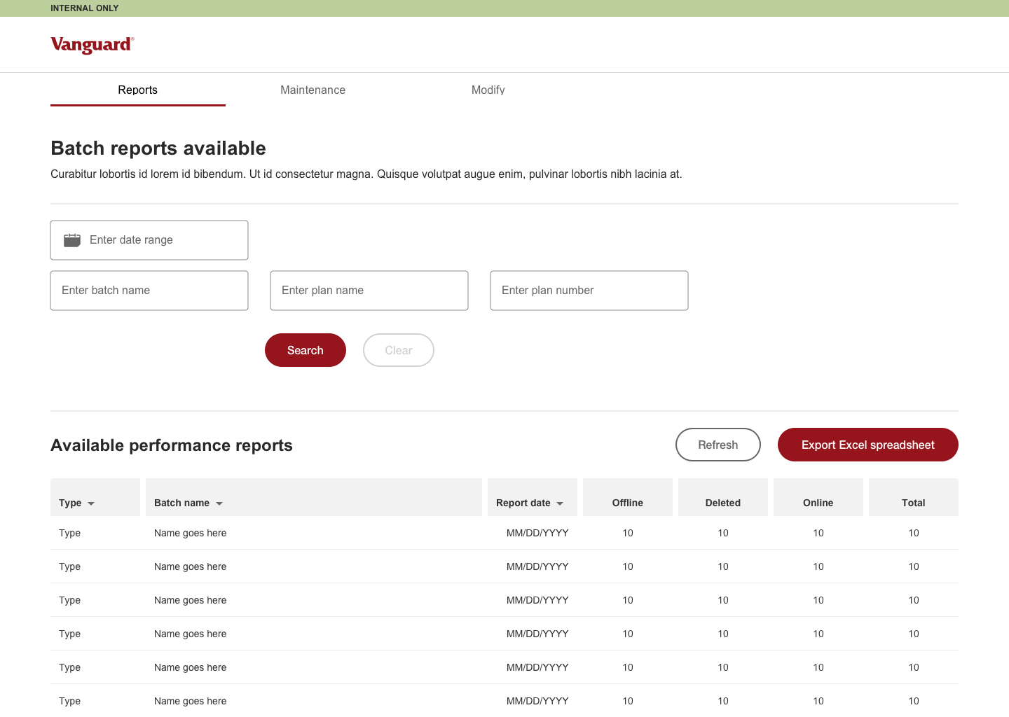
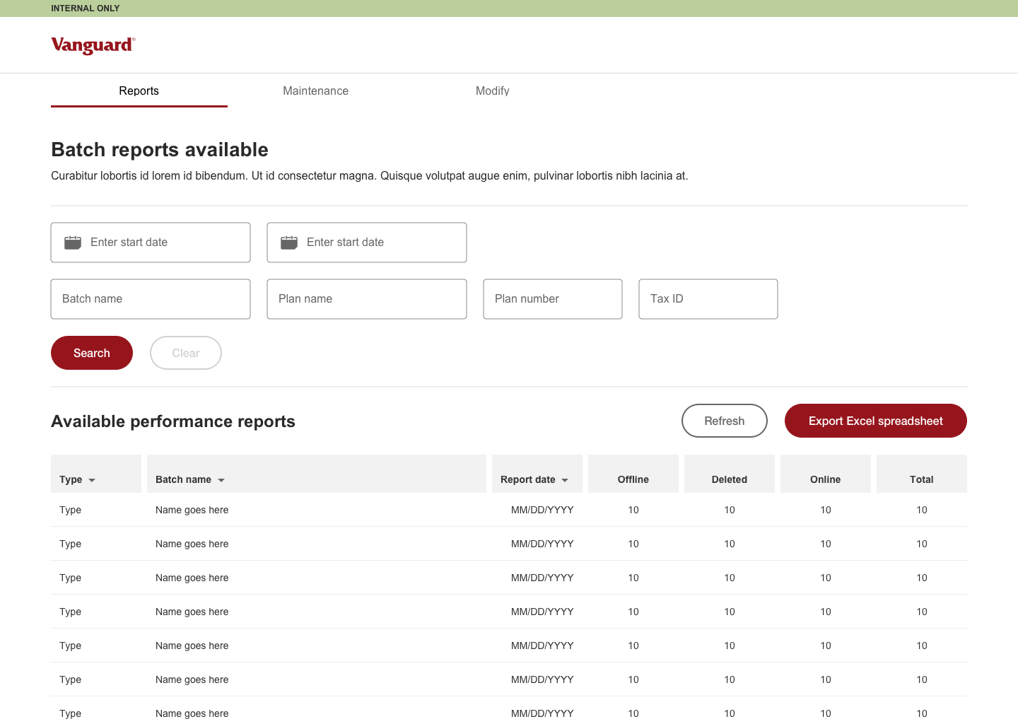
Simplify and Organize
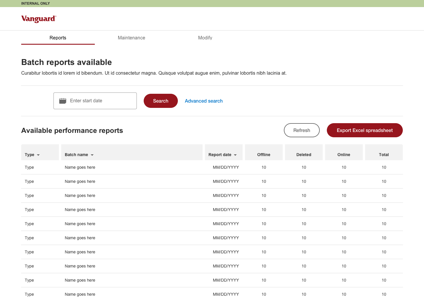
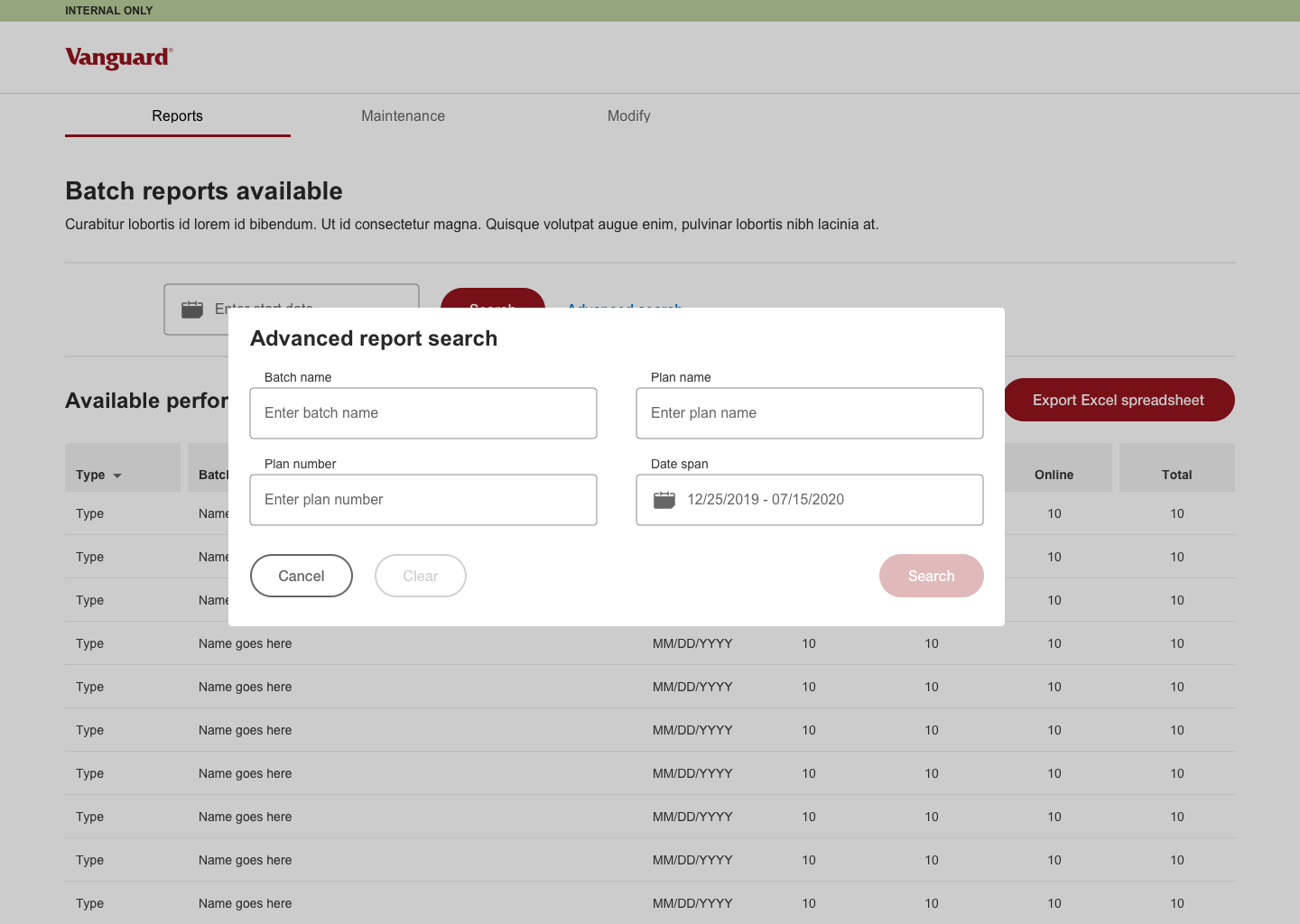
The low hanging fruit for this project was to consolidate the search options that spanned two navigation tabs, organize the search results for ease of reading and editing as well as implementing the ability to review during modifications . There were tabs that had overlapping functions with confusing or vague usability. The next step was to implement new functionality seamlessly into the existing tool without over complicating it and making sure the hierarchy matched the options users would utilize the most. I made sure I supplied several options with reasoning as I presented and tested with the team so they were involved as we created the best version possible.
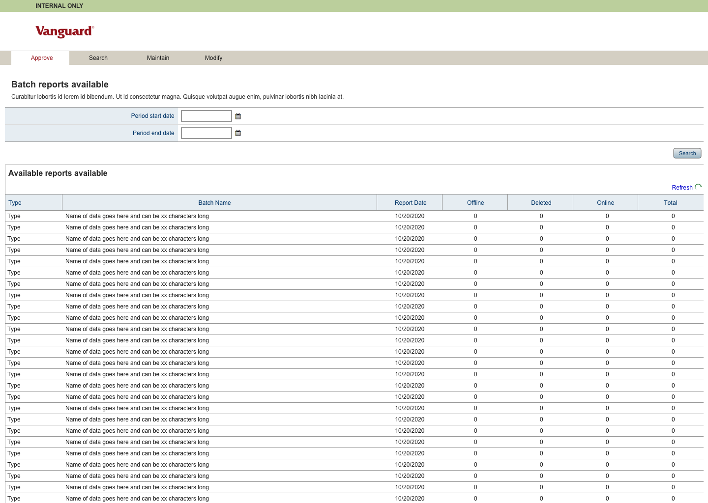
The original design
UX changes to the existing aspects of the tool included consolidating redundant search options, expanding search capabilities, organizing and streamlining search results to make them easier to read and interact with, as well as giving users proper feedback during creation and edits.
As you can see in the original design, the first tab had a date search while the second tab was all the search functionality (repeating the date options). Adding to that, the team wanted to have more search options to take advantage of the update on the backend.
Original tool design

Original tool search tab
Search options
Search design 01
Search design 01

Search design 01
Search design 02
Search design 02
Search design 03
The biggest change was combining the two tabs for searching reports. I gave the team options since there were several different types of users. In the end, I found through testing that simplifying the date to a single picker actually didn’t work well since most searches spanned months if not longer. I went back to two fields for ease of use.
Since Angular design was implemented for this project, there was ample documentation for elements. Vanguard has created their own branded version, so I was able to adjust easily. There was no Design System (DS) in place so I took the time to build several elements that I would be implementing frequently, all utilizing an Atomic Design approach (building from small elements to larger patterns).
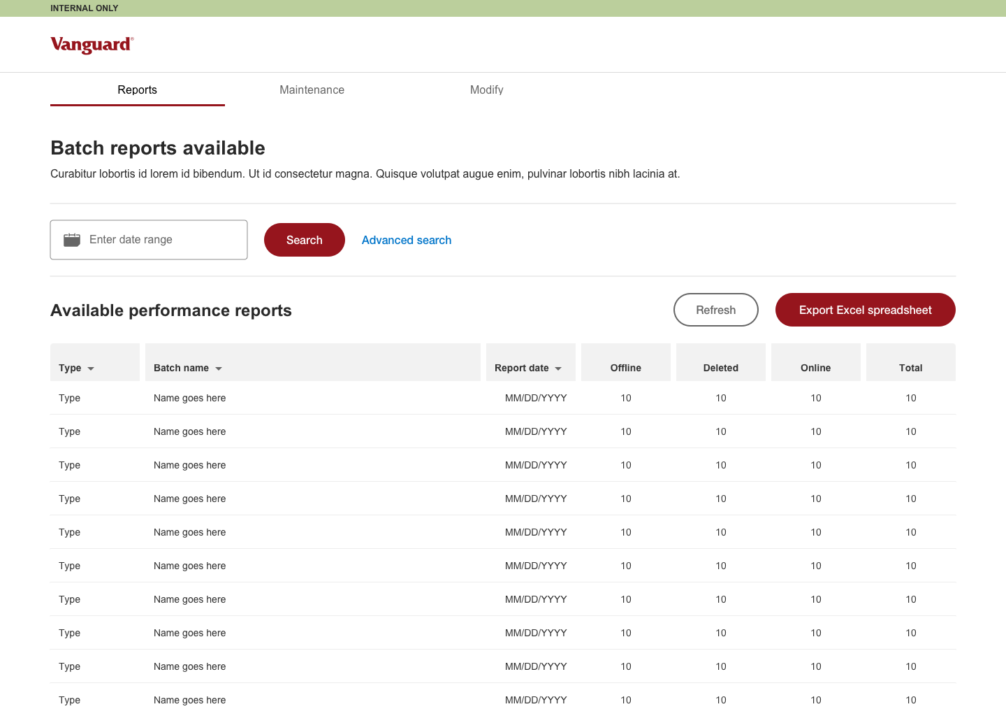
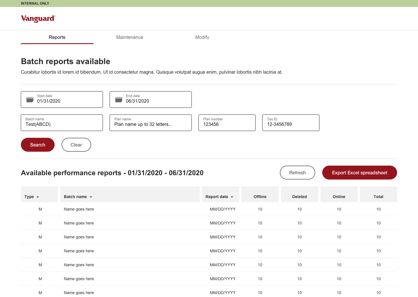
Search results
I redesigned the entire experience for search results because a specific pain point for users was the muddled results and having to wade through far too much data (and the list of reports can be LONG!).
One item that stood out was users could perform a search and find the specific plan they were looking for, but then they had to back out of the search to find the batch the plan was in. A simple solution was to create a text link on the batch name so they could immediately navigate to the entire batch. To me, this seemed like a clear option but it was missing for so long that the team was excited at the design when I presented it.
Lastly, I created two patterns for search results depending on what was queried. Date and Batch search came back with the standard header while Plan name, Plan number and TIN (Tax ID Number) came back with the hyperlink header and specific plan or plans (some clients have the same TIN but several different plans. Add that to the list!).
Batch search results
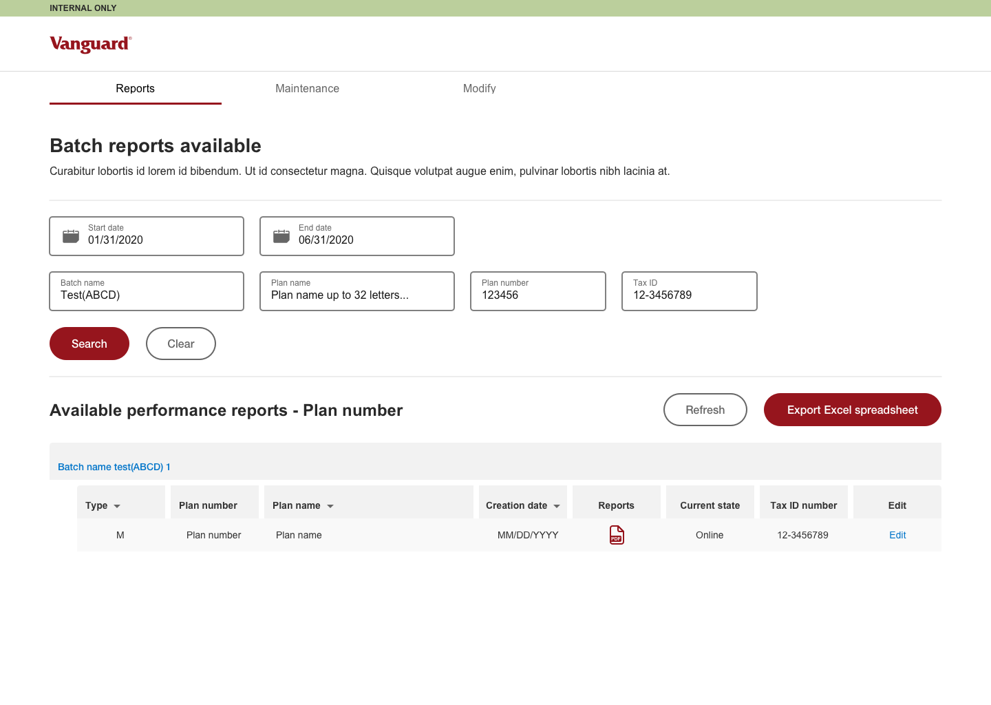
Plan number search results
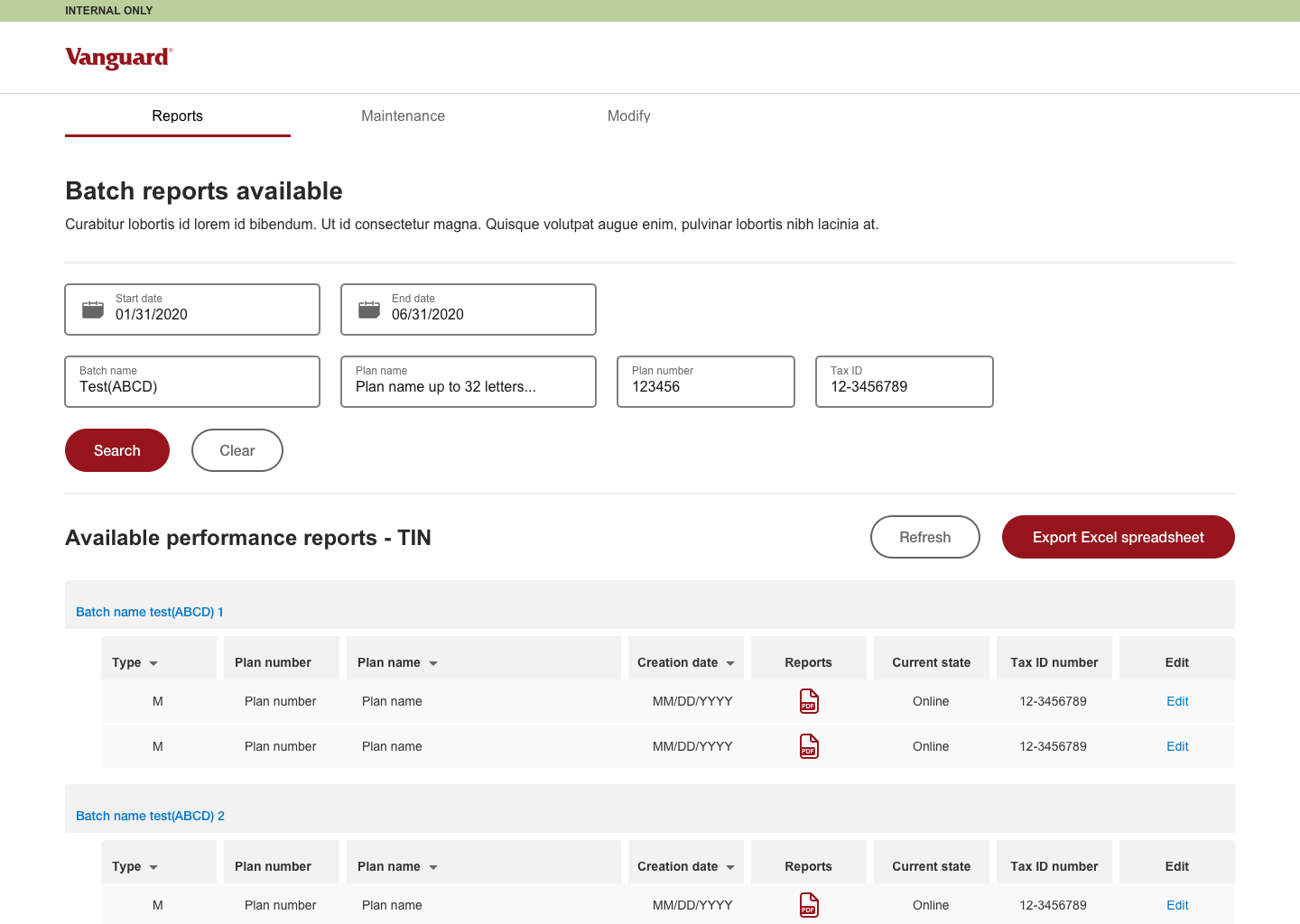
Tax ID (TIN) search results
UI update
Angular Update
As with other Angular updates that I worked on within Vanguard, this project allowed a lot more breathability, leading to a design that was less cramped and visually appealing. For most of the design I was able to use the standard Angular elements that Vanguard had created while also designing a couple of custom elements to fit the needs of the tool. I also made sure to implement ADA compliant measures, which was something the team did not consider prior to my involvement. They appreciated the addition and wanted to make sure it was a priority moving forward.
UI pattern kit

Since Angular design was implemented for this project, there was ample documentation for elements. Vanguard has created their own branded version, so I was able to adjust easily. There was no Design System (DS) in place so I took the time to build several elements that I would be implementing frequently, all utilizing an Atomic Design approach (building from small elements to larger patterns).
Next steps
Moving to Development
As of October 2020, this tool is moving into development. I will work closely with the dev team to tweak any issues or discuss items along the way. I also plan on doing PIT (Page Integrity Testing) when pages are developed but before going into the production domain. I will also sit in on some testing with the team and some users to make sure the site works as described and do updates through the end of the year. I plan on revisiting this page to reflect any updates.